
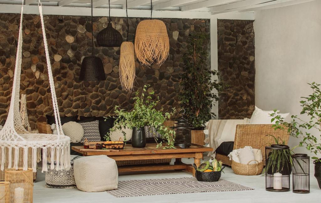
Light, Layout, and Proportions
North-facing rooms love warmer greens to counter cool daylight, while sunny rooms can handle moody emerald without feeling dark. Test window treatments that diffuse midday glare, and try reflective surfaces to bounce natural light deeper into corners gracefully.
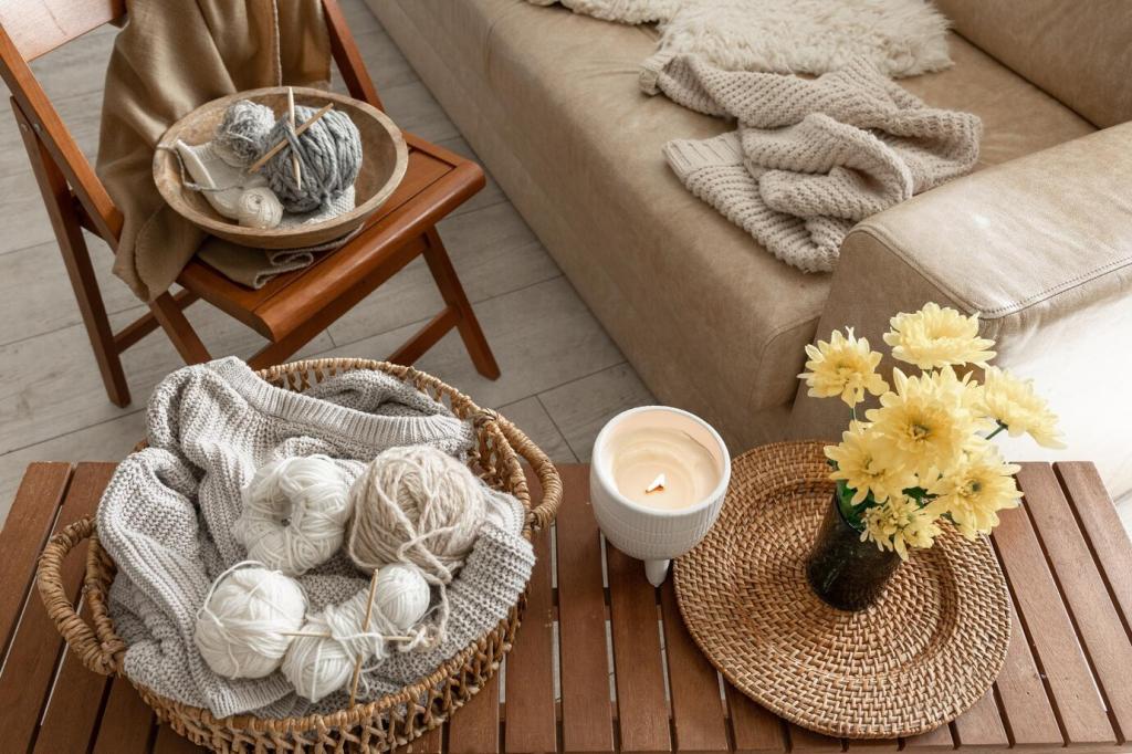
Light, Layout, and Proportions
Combine ceiling lights for function, floor lamps for ambient warmth, and picture lights to highlight art against green walls. A dimmer turns movie nights cozy, while adjustable task lamps keep reading nooks bright and inviting on shorter winter afternoons.